In Power Apps, a flexible height gallery is a dynamic container that shows a collection of data. Based on the information it contains, it dynamically adjusts its height to fit different types of data.
By adapting to various screen sizes and presenting data in an organized way, this aids in the creation of adaptable and aesthetically pleasing interfaces.
Steps to Implement Flexible Height Gallery
- Create a canvas app and add a blank flexible gallery.
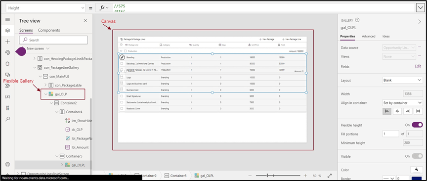
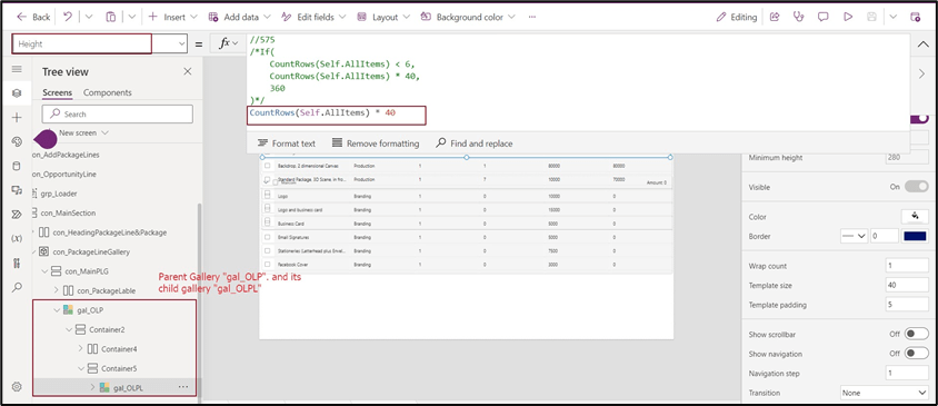
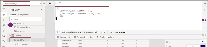
- Set Template height /Minimum Layout for this gallery.

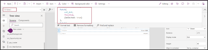
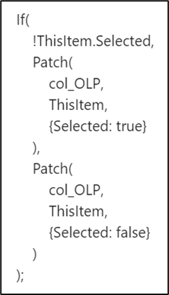
- Add a child gallery and set the height of the gallery as a self-gallery count.
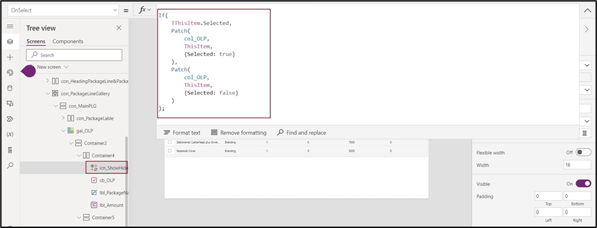
- On selection of the parent gallery, it will show its child gallery and vice versa.
Note:
Conclusion:
1. Responsive Design: Flexible galleries adjust fluidly to various screen sizes to ensure that images are shown appropriately and proportionately on platforms ranging from tiny smartphones to giant desktop monitors.
2. Better user experience: Viewing images doesn’t require users to zoom in or scroll far.
3. Cross-Device Compatibility: With flexible galleries, your material is available on many platforms, including smartphones, tablets, laptops, and desktops. This improves the overall user experience and decreases annoyance, making it easier for visitors to engage with your content. Your potential audience and engagement are increased by this compatibility.
4. Uniformity: Flexible galleries contribute to uniformity in look and feel across devices. This uniformity strengthens your brand identification and gives users a sense of professionalism.
Thank you, Vijay for your valuable input.
 D365 Feeds