Problem Definition:
Building cloud flows of acceptable quality, should be in the mind of every Power Automate developer. After hearing this guideline, one would naturally ask what makes a flow ‘good-quality’. Furthermore, how can we be aware whether a flow is working up to its full potential? This blog shall provide the answers to these types of questions. After all, our goal is not only to automate processes in Dynamics 365, but to make them efficient – every connector used should serve a purpose, that the flow cannot do without. To begin your cloud flow investigation, first start off with a sample cloud flow.
Solution:
Once you are done opening your cloud flow in Power Automate, click on ‘Improve your flow’.
Your cloud flow will keep track of its run history – This can help you analyze if your flow
has improved, or if any new issue has been discovered during the different runs of the
flow. Once clicked on, the flow’s downloading process will start.

After the download is completed, you will see a pop-up stating your report is ready. A Power
BI dashboard will be opened, where you can see all information about your flow, such as a
flowchart, average case duration, the custom attributes that have been used and much more!
Interestingly, you can even add your own custom filters if you want to keep track of
differences among different versions of the same cloud flow.
The screenshot below can give you a better understanding on how the dashboard will look
like. Out of all the components of the dashboard, let us explore the flowchart in better detail.
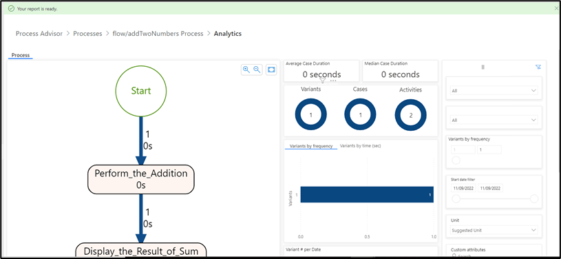
Notice how your flowchart will contain nodes and arrows, highlighted differently, with
different thicknesses and will be marked with labels and number. Here is a brief explanation
of the meanings of the labels. An arrow with a greater thickness indicates that the step is
frequently executed, as compared to steps which have a thinner arrow. In addition, the darker
the node, the longer will be the execution time.
As far as the labels are concerned, the number at the top indicates the number of seconds
it took for a particular step to execute, and the percentages show the probability of visiting
a specific node.

Consider the Following Points:
- Ideally, you would want a flowchart that has no dark shaded nodes, eliminate unnecessary nodes, and have fewer branches. However, this may not be possible all the time. Just minimize the factors that contribute to performance of the cloud flow.
- The Process Advisor examines the flow by using ‘process mining’, which is an AI-based technique.
- There are already pre-defined templates that you can choose from, to gain a better insight to your flow. That includes Azure DevOps, PowerApps, Desktop flows, and the scope goes beyond just these templates.
- Zero coding knowledge is needed to achieve this automation. All that is needed is a basic understanding of cloud flows, and how each of the process insight features work.
Conclusion:
To fully understand how the ‘process advisor’ works, just play around with the dashboard, and try using it on any flow that you currently have on your CRM environment. Then, try making minor changes on the flow, and notice the changes that take place in the dashboard. Jot down your observations and make gradual improvements, when inspecting the next cloud flow given to you. Happy learning!
References Used:
https://docs.microsoft.com/en-us/power-automate/task-mining-tutorial
Thank you, Tanmay for your inputs.

One thought on “Boost Cloud Flows with Process Insights”