Problem Statement:
Hi there, and thanks for visiting the blog. Today, we’re going to concentrate on the Slicer Visual, which is among Power BI’s most engaging and user-friendly features. One kind of visual on a report page that filters other visuals is called a slicer. Slicers are displayed directly on the report canvas for everyone to utilize, eliminating the need to use the filter window that is limited to it. By enabling users to dynamically examine data at their own pace and in accordance with their needs, they greatly enhance the value of your reports. However, there are drawbacks to this Slicer visual, particularly when the developers were utilizing the tile layout. In order to counter this issue Microsoft released a new “Slicer Visual” in November 2023 Update to address this issue and enhance the user interface (UI) for users.
NOTE: Currently this feature is in Preview.
So, now let’s dive in to explore this new visual so that you can leverage it in your Power BI Report.
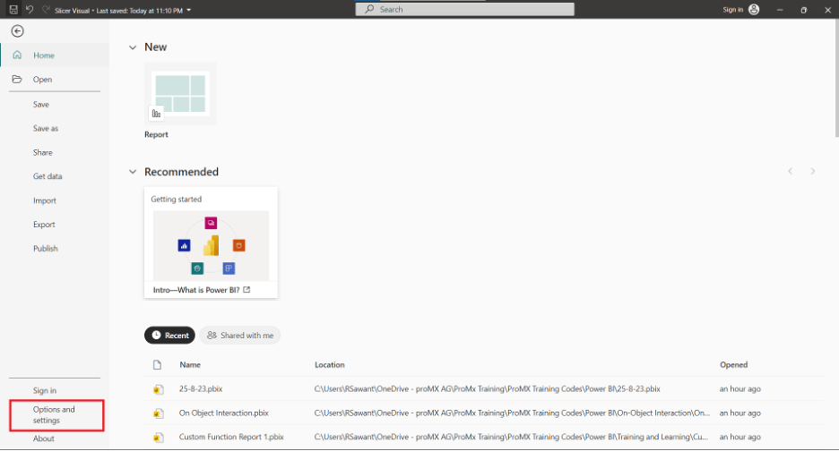
As this feature is in Preview mode, we need to activate this feature from the “Settings in Power BI”. To do so follow the following steps and click on the “File” tab shown in the below screenshot.

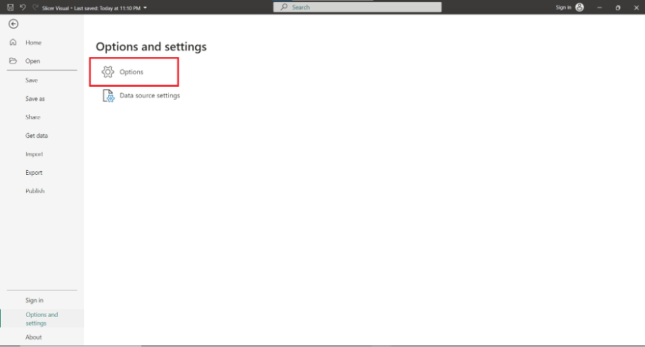
Then head to “Options and Settings” option as shown in the below screenshot.
After clicking on the “Options and Settings” option click on the “Options” as shown in the below screenshot.
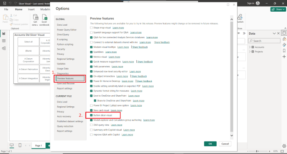
After clicking on Options you will be directed to the below window, then click on the “Preview features” tab and tick the “Button Slicer Visual” and Click on “OK”.
After turning on the feature and moving on to the visual pane in Visual view you will see the new Button slicer Visual as shown in the below screenshot.

After getting the new Button Slicer Visual, we will see how it works and what features it contains. For that, I have considered demo data which consists of two tables which are having data of customers and Projects and it consists of a simple graph of No. of projects per Customer. And the Slicer consists of data of Accounts. Which we can see in the below screenshot.
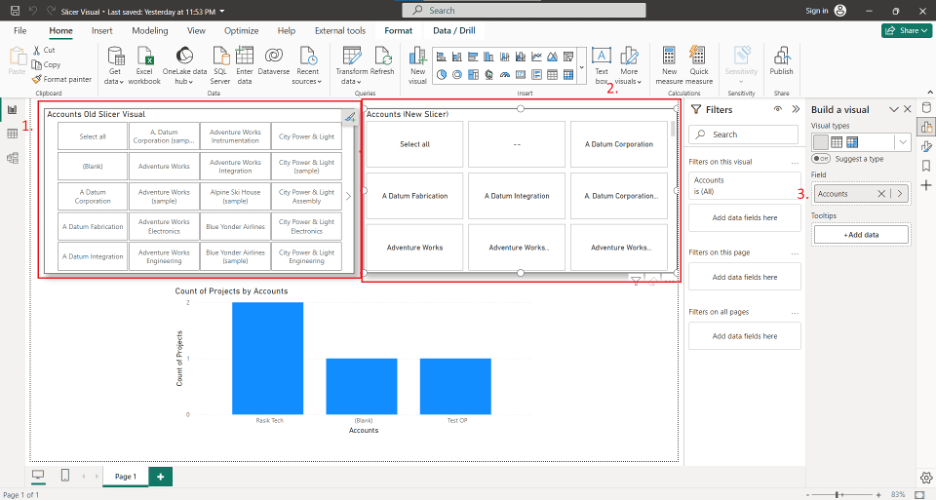
In the above screenshot, we can see that there are two slicers One slicer is the legacy one and the other is the new Button Slicer. We can see that the new button slicer is visually cleaner than the legacy one. Now let’s dive into the new “Button Slicer” “Format” Pane as shown in the below screenshot.

Fig 1: New Button Slicer Visual Format Pane.

Fig 2: Legacy Slicer Visual Format Pane.
Now when we have seen the differences between the Visual Tab Options let’s see what is new in the New Button Slicer Visual section.
a. Shape Section:
This Section allows to formatting of the shapes of the button in the New Slicer. Below are the screenshot of the three options and outputs available for it.

I. Rectangle Shape Options
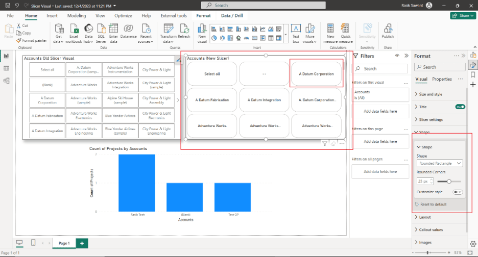
II. Rounded Rectangle
(here you can see that we can customize each corner of the button)
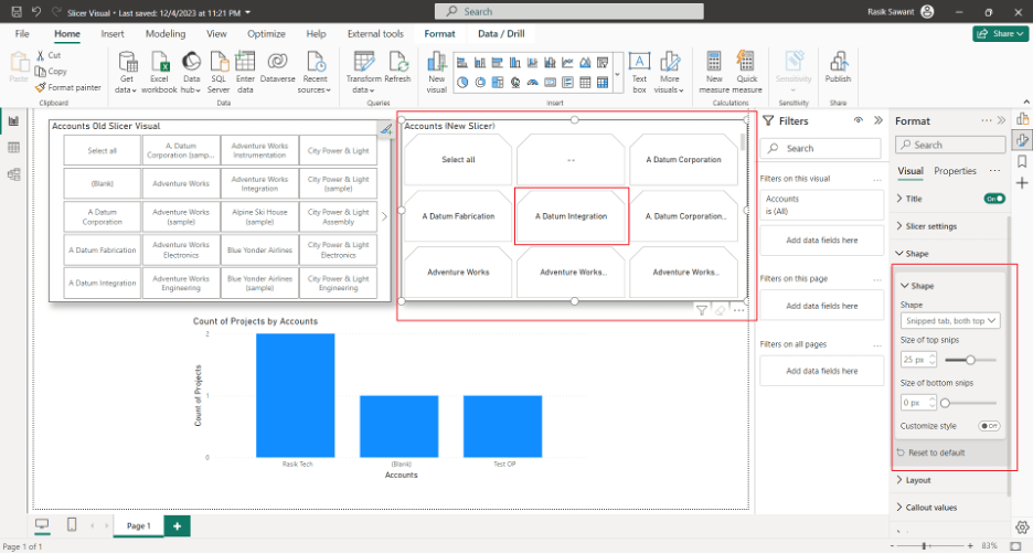
III. Snipped Tab, both top
b. Layout Section:

The above screenshot shows the layout section which has a Sub-Section, the Layout Sub-Section consists of the Alignment of text, Rows, and Columns in the visual, thus deciding the number of buttons in each row and column in the button slicer visual also we can define the Space between the cards. Moreover, we can also define the Overflow whether the Visual should have a continuous scroll or paginated Scroll, and the direction of the Overflow. The above screenshot represents the Continuous scroll and the below screenshot depicts the Paginated style Overflow.

c. Callout Values
This Section provides extra customization related to values. The below screenshot shows the comparison between the Values Section (Old Slicer Visual) and the new Callout Values (section)
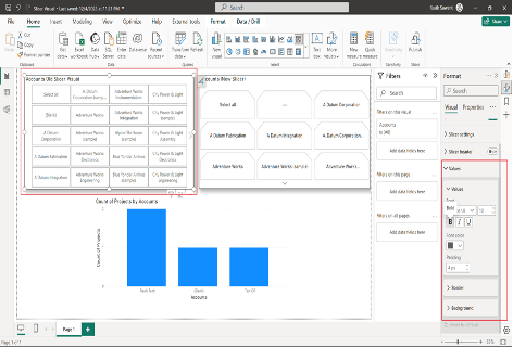

In the new slicer, visual new can see the State option which gives us more flexibility related to Customization.
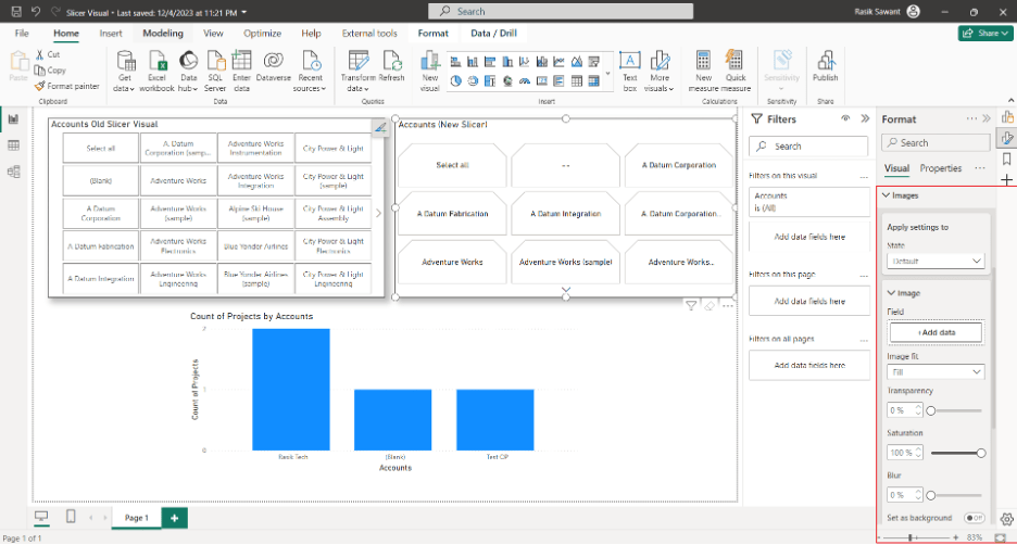
d. Images
This section allows us to add the Image data for the button and gives us the option to customize the image such as size, transparency, Blur, or if you want to set it as a Background, Moreover, you can also customize the position of the image.
e. Buttons.
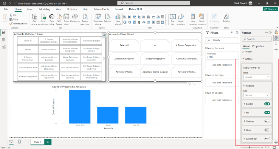
The above screenshot highlighted section shows the Button section which allows you to do minute customization over a button of the slicer visual.
These were all the changes in the Visual Tab, in the Properties Tab there is only one section added in this new visual which is the option to add a tooltip and its related Customization. The below screenshot shows the following section and its Sub-Sections.

This is it for the new Button Slicer Visual that was introduced for Power BI Desktop. If you like this blog then please like the blog and feel free to comment for any suggestion.
